Data Science Project Failing After 1,600 Days

⭐ I spent >1,600 days working on a data science project that then failed because I lost interest. This article is to cope
with the failure and maybe help you (and me) to finish successful data science projects by summarising
a few learnings into a checklist, see below.
Nobody really likes to speak about failures. The same holds true for failed data science projects.
In this text, I document my most recent data science project which I worked on for 1,600 days –
days that I won’t get back despite the project failing.
Ultimately, it is important to communicate about failed projects similarly to successful projects
as those failed ones are the ones that help us to acquire scar tissue (thanks Andrej) which makes us better data science
practitioners. And the latter is what we should all strive for!
After completing a substantial hobby data analysis project involving 1.5 million Nextbike
datapoints, I wanted to explore a different data modality: text. While my previous
work had focused on numerical analysis, I wanted to explore text as data source while delivering
some value. This opportunity presented itself in March 2020, just as COVID-19 began making
headlines. I discovered that Germany’s public news outlet, Tagesschau,
had launched a COVID-focused newsticker, aggregating everything from case numbers to policy changes
and breaking incidents.
The COVID newsticker provided both a compelling topic and an ideal text data
source. My plan was to scrape the entire newsticker over time and analyse it for both
metadata patterns, such as posting frequency, and deeper semantic insights about the people,
topics and countries involved. When COVID became less of an issue the Tagesschau shut down their
COVID newsticker in 2022-Q3 but launched a new one covering the emerging Ukraine-Russia war.
I seamlessly extended my project to collect also this new data stream.
I stopped working on the project in 2024-Q3 after 1,600 days of collecting data and some short data exploration
because life got busier, my priorities shifted and I had less free time at hand. Unfortunately, I never performed
any sort of serious data analyses except aforementioned short data exploration that I did after one week
into the project in 2020-Q2.
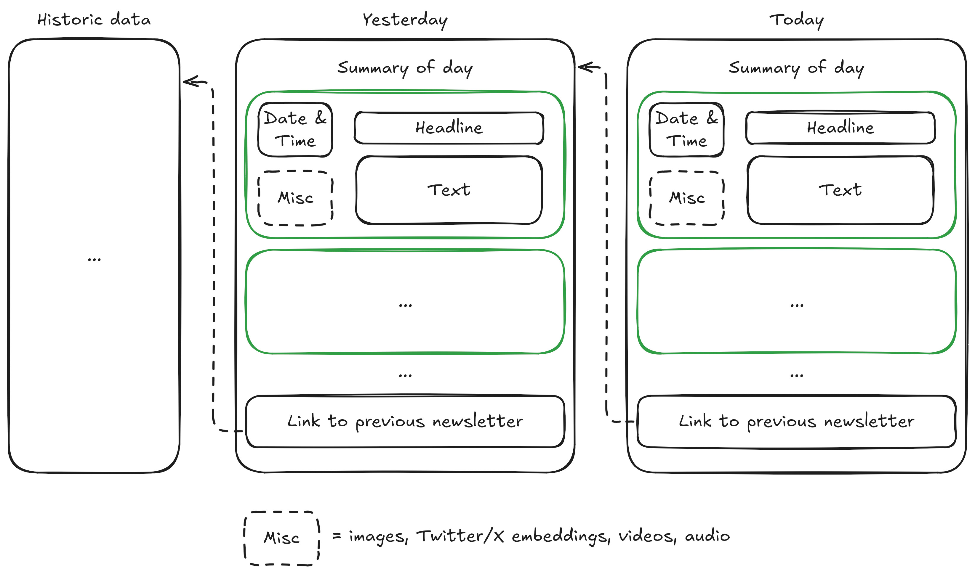
The raw data format of the newsticker is shown in the figure below and explained in words below
the figure.
Every day featured a list of short news stories (shown in green),
each containing a timestamp, headline, body text and optional multimedia elements like Twitter/X
feeds, videos or audio clips. Each day normally linked back to the previous day.
I collected all the URLs and downloaded the underlying raw data from 2020-Q1 to 2024-Q3 for around
1,600 days while working towards my PhD and writing up my thesis. Then, I stopped because I lost
interest in the project and didn’t have time to continue it anymore.
The system is a semi-automatic data pipeline which extracts raw data from the German news outlet Tagesschau
once a day and turns the raw unstructured data into structured news snippets that make up a dataset.
If I would have finished the project, this dataset would then have been released and used for
a number of analyses using Python.
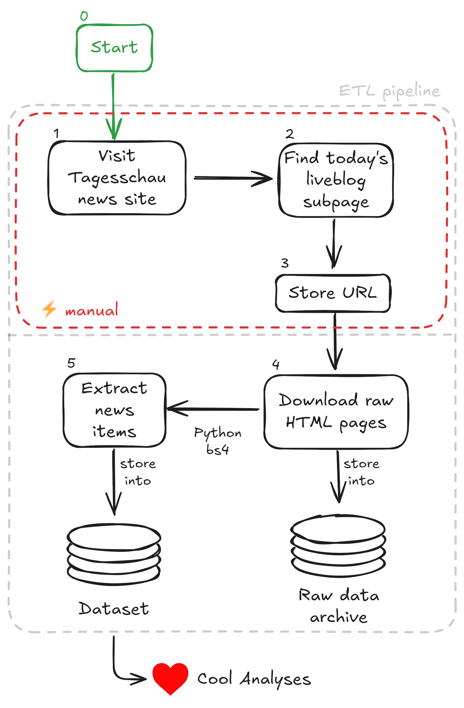
The project system design is shown visually in the below figure and explained with words afterwards.
The data collection process involved a daily ritual of manually visiting the Tagesschau website to
capture links to both the COVID and later Ukraine war newstickers. While this manual approach constituted
the bulk of the project’s effort, it was necessitated by Tagesschau’s unstructured URL schema, which
made automated link collection impractical.
Every four to eight weeks, I would use Python to batch process these accumulated URLs, downloading the
underlying HTML pages as raw data. The emphasis on preserving raw HTML proved vital when Tagesschau
repeatedly altered their newsticker DOM structure throughout Q2 2020. This experience underscored a
fundamental data engineering principle: raw data is king. While parsers can be rewritten, lost data is irretrievable.
The technical pipeline itself was straightforward: Python scripts with BeautifulSoup4 parsed the
HTML pages into structured news items, which were then stored in an SQLite database. The end goal
was twofold: to share this unique dataset with the broader community and to conduct what I optimistically
labeled as “❤️ Cool Analyses” – though these analyses would ultimately remain unrealized.
Many parts of the project were on autopilot. That is except for two parts: (1) the manual
ETL pipeline part and (2) the actual analyses. While part (2) would have been the actual fun part, I spent
1,600 days doing (1) starting in ~2020-03 and ultimately abandonning the project in 2024-Q3.
In the future, I will use the following short checklist of advice to conduct successful (data science) projects.
The list is roughly ordered by decreasing relevance:
- Consider story telling from day one. While my Nextbike project
had that built-in, this project would have been much more difficult to talk about because of the
negative topics of COVID and a war. - Get first analyses results out quickly based on a small dataset and don’t just collect data
up front to “analyse it later” – this is what I did here and it’s bad. Data postprocessing and
releasing some results as teasers are mostly important for you as after all, quick results keep
us motivated; e.g. for me, the present Tagesschau project was very interesting in the beginning
but I lost interest over time because of mindless data collecting. Ideally, given these first
results follow “Show Your Work” approach by making
the results public; this is super difficult for perfectionists. - Automate the h*ll out of your data science project (in particular the data acquisition part)
to reduce daily friction. If the automation process takes considerable work, then perceive it as a separate
topic to speak about online, again following the “Show Your Work” approach. For example,
the manual step in the process of my project could have been a beautiful and innovative machine
learning opportunity. Back then, I would have trained a specialised model (or used a pretrained specialised model)
but since LLMs made so much progress during the runtime of this project from 2020-Q1 to 2024-Q4, I would now
rather consider a foundational model wrapped as an AI agent instead; for example, I would try to find a
foundation model to do the job of for example finding the right link on the Tagesschau website, which was
by far the most draining part of the whole project. - Data cadence is relevant: Do you have to collect the data yourself over a period of time?
If yes, how often do you have to collect it – as in how often per hour for example? For the present
project, I had to scrape data only once per day, which is doable manually. For my previous NextBike project,
however, I scraped data every 30 seconds. Since I scaped an API, the automation of that process was fairly simple. - Store raw data if possible. This allows you to condense it later.
- Consider using the cloud for simplicity, reliability and last but certainly not least developing
real-life employability skills (I am looking at you, University, that often fails to deliver the latter).
Go out and build something!
A failed data science project is part of the learning experience and contributes
to your battle scar tissue; battle scar tissue through projects is a great concept from Andrej Karpathy
(see here and there)
& certainly makes us better data practitioners.
Personally, I would have loved to use the beautiful applied ML opportunity of identifying the right
newsticker link on the Tagesschau website using NLP to remove any manual labour but unfortunately, I don’t have
the time to do so. Also, I would have loved to evaluate the ~100,000 news
snippets that I collected and shared the dataset – but I will not; although I still think that these news analyses
would be super interesting!
Good news is that Tagesschau keeps releasing newstickers like for example for the US election 2024.
If you’re interested in picking up the project and getting some battle scars in, then please
drop me a message – I am happy to share the whole project with no strings attached :-).
Thanks to everyone who proof-read early versions of this text:
Simon Barnes.


